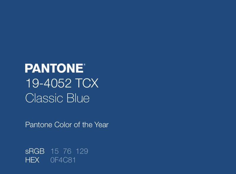
Pantone announced that Classic Blue would be the color of 2020.

I like blue. It’s, perhaps, my favorite color. I have worn more blue clothes than any other color. But is it a good color at this point in time? To have the blues means one is sad or down. In German slang the words “Ich bin blau!”, I am blue, mean that I am drunk. I think a green color would have been more appropriate, considering everything that’s going on with the environment.
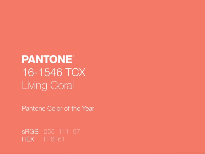
Likewise I wasn’t impressed with Pantone’s choice for this year, 2019, Living Coral:

In 2018, when coral reefs were bleaching at an alarming rate, the announcement seemed like a rather tone deaf idea.
Makes me wonder, how do they arrive at selecting the color of the year? In any case, they could do better, I think.


“The world is blue at its edges and in its depths. This blue is the light that got lost. Light at the blue end of the spectrum does not travel the whole distance from the sun to us. It disperses among the molecules of the air, it scatters in water. Water is colorless, shallow water appears to be the color of whatever lies underneath it, but deep water is full of this scattered light, the purer the water the deeper the blue. The sky is blue for the same reason, but the blue at the horizon, the blue of land that seems to be dissolving into the sky, is a deeper, dreamier, melancholy blue, the blue at the farthest reaches of the places where you see for miles, the blue of distance. This light that does not touch us, does not travel the whole distance, the light that gets lost, gives us the beauty of the world, so much of which is in the color blue.
For many years, I have been moved by the blue at the far edge of what can be seen, that color of horizons, of remote mountain ranges, of anything far away. The color of that distance is the color of an emotion, the color of solitude and of desire, the color of there seen from here, the color of where you are not. And the color of where you can never go. For the blue is not in the place those miles away at the horizon, but in the atmospheric distance between you and the mountains.”
― Rebecca Solnit – A Field Guide to Getting Lost
I doubt Pantone had any of that in mind when Classic Blue was picked for color of the year. As for coral, I can’t begin to imagine.
I love that. Blue is an amazing color… but for 2020?
Perhaps clear should have been the choice. Making things transparent may help our collective vision.
Fascinating how this comment and Victor’s comment on the post Pattern dovetail!!
Thank you for sharing this poetic piece and introducing me to R. Solnit.
:)
My new favorite color!
I think blue is the most beautiful color and should be left purely as such. The incomprehensible assignments of meanings to “blue” are mere wanderings of the human mind. This goes for all colors.
Blue has always been my favorite color in the spectrum no matter what shade. Thanks Matt for that lovely post on the color blue. One of my favorite songs that I am actually listening too now is Winter Blue from Winter Rose. Ottmar–I always wonder how you come up with song titles –especially for Winter Blue?
I really don’t know, Luz. I walk around listening to the music… a lot. I write down words that I think might fit. I create lists of titles that I narrow down until I have a title that seems to work. I do believe that it’s especially important for instrumental music to have titles, because those titles are little sign posts that suggest a possible path for the listener to take. A hint, a suggestion, a direction, a theme.